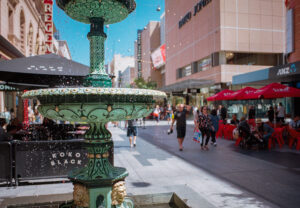
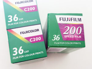
For designers looking to streamline their workflow and ensure uniformity across their imagery, mastering the “Photoshop Match Color” tool is indispensable. This feature is adept at equalizing the color and tone between photographs, transforming it into a seamless process courtesy of sophisticated AI technology. It’s particularly useful for adjusting photos that have diverged in color tone due to various factors—such as differences in the time of day they were captured or shifts in white balance settings. Additionally, it proves invaluable when dealing with inconsistencies between 3D renders due to alterations in rendering settings.
Imagine you’re working with a set of stock photos captured within a specific setting, featuring a model in a house. Your project requires the image to depict daylight, yet the available shot is taken in the evening. This scenario, where a day-lit version of the photo is unavailable, perfectly illustrates the necessity and efficiency of the “Photoshop Match Color” feature. This happened to me recently. I needed to use this image.

But I needed it to have been taken during the day, and not have this orange evening look.
I found this image of the same location, taken during the day, and was able to use it as a source image to match the colours.

Utilizing “Match Color” to Achieve Photographic Consistency
The process of matching colors between images with Photoshop is straightforward, ensuring your photographs convey a consistent aesthetic. Follow these steps to effortlessly match color tones between your source and target images, enhancing the cohesion of your design elements.
Initiating the Process
Begin by opening both the source and target images in Photoshop. Navigate to the layer on the target image that requires adjustment to ensure it’s selected for the color matching process.
Activating Match Color
Access the Match Color feature by selecting Image › Adjustments › Match Color from Photoshop’s top menu.
This action opens the pathway to color and tone harmonization between your chosen images.
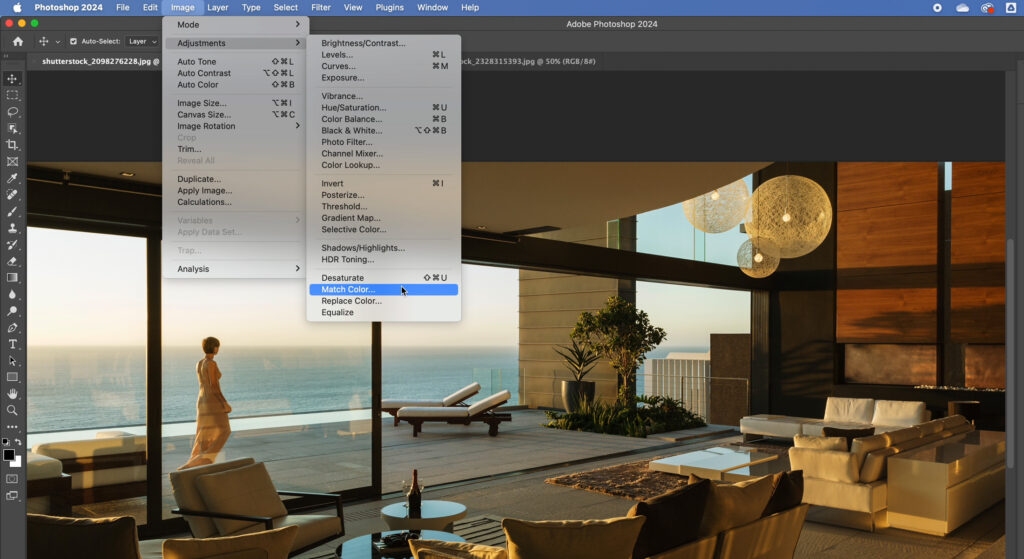
Specifying the Source Image
Within the Match Color dialog box, you’ll encounter Image Options sliders and a Source box. Here, designate your source image from the dropdown menu, establishing it as the reference for the color matching operation.
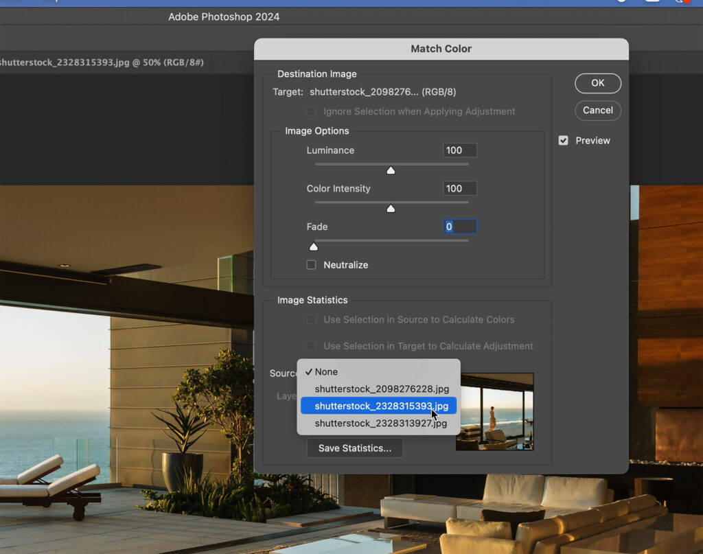
Fine-tuning the Outcome
With the source image selected, a preview enables you to gauge the initial matching results. Adjust the luminance to tweak the brightness level, and manipulate the Color Intensity and Fade sliders to refine the color matching to your satisfaction. Confirm your adjustments by clicking OK in the dialog box.
By incorporating “Photoshop Match Color” into your design toolkit, you empower yourself to bridge the color discrepancies between photographs with ease, ensuring a harmonized visual narrative across your projects. This tool not only simplifies the color matching process but also significantly enhances the efficiency and quality of your design outcomes, making it a critical skill for any designer focused on producing cohesive and visually appealing work.


