


Interesting concept. Distinctive look. Not a film I’ll be buying again. Lomography has built a reputation for producing films that embrace imperfection. Their films are often less about technical accuracy and more about mood, nostalgia and experimentation. The latest addition to the range, LomoChrome Color ’92 Sun-Kissed, promises warm golden tones, classic analogue character and a healthy dose of 1990s nostalgia. On paper, it sounds like a perfect film for photographers who love vintage colour palettes and dreamy summer images.
I wanted to like it.
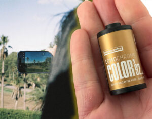
I loaded a roll of LomoChrome Color ’92 Sun-Kissed into my Leica MP, paired it with my Leica 35mm f/1.4 Summilux, and spent a day shooting in bright South Australian sunshine.
Unfortunately, after seeing the results, I came away disappointed.


What Is LomoChrome Color ’92 Sun-Kissed?
LomoChrome Color ’92 Sun-Kissed is an ISO 400 colour negative film processed using standard C-41 chemistry.
According to Lomography, it offers:
- Warm orange and yellow tones
- Nostalgic 1990s-inspired colours
- Rich grain structure
- Deep blacks
- Flexible exposure latitude
- Strong performance in a variety of lighting conditions
It is essentially a warmer version of the original LomoChrome Color ’92, which leaned towards cooler blues and greens.

The idea is appealing. Rather than producing neutral, realistic colours, the film deliberately creates a stylised look with a strong personality.
The problem is that, for me, it tries too hard. It certainly has a 1990s look to it, if that is what you care going for. There is a odd colour, it looks like a late 1980s or early 1990s colour film or video aimed at consumers and has that feel for a consumer photolab.


My Leica MP Test
For this review, I shot a full roll through my Leica MP using a Leica 35mm f/1.4 Summilux.
Conditions were ideal:
- Bright sunshine
- Outdoor scenes
- High-quality optics
- Professional development and scanning
In other words, this was a good opportunity for the film to shine.
Instead, many of the characteristics that make Lomo 92 Sun-Kissed unique became distractions.

This film is certainly sharp, but not detailed. The excess of grain helps to to be contrasty with clear lines and sharp edges, but that results in a lack of fine detail. Sharpness and detail are very different things, and I prefer to go for detail.
Colour Range Falls Short
The area where I was most disappointed was colour reproduction.


Looking at my colour test chart, several colours simply didn’t reproduce accurately.
Notably:
- Magentas shifted noticeably towards red
- Cyans appeared closer to blue
- Subtle colour transitions were compressed
- Overall colour separation felt limited
There is a lack of tonal range for the colours in general. Colours are substituted or blended. This means that we loose details and tons that would preserve more information in the image. This is obviously intentional. Lomography isn’t aiming for accuracy.
However, the issue isn’t simply colour shifts. It’s the reduction in colour range itself.
Many film stocks bend colours while still preserving subtle tonal distinctions.
With LomoChrome Color ’92 Sun-Kissed, I found multiple colours collapsing into similar-looking shades.
The palette becomes narrower than I would like.
Let’s Compare the Colour Charts
By comparison, here is the Kodacolor 100, Ilfocolor Vivid 400 chart comapred.


In reality, you can see how the reds pop and oversaturate compared to other colours – look at the Australia post signed compared to the green trees and blue in the sky.

By comparison, yellows, greens and more orange don’t have as vibrant or joyful a loo, but you can see the benefit of the red saturation on the autumn colour leaves.


Too Many Effects, Not Enough Character
The biggest issue I have with LomoChrome Color ’92 Sun-Kissed is that it feels like several film effects have been stacked on top of one another.
The film pushes warm colour shifts.
It pushes grain.
It pushes contrast.
It pushes black levels.
It pushes highlight glow.
Individually, any one of these traits could create a distinctive character. Together, they compete for attention.
As a result, I found the film lacked a coherent identity. Instead of feeling naturally nostalgic, many images felt artificially stylised.
It is a film that constantly reminds you that you’re shooting a special effect film.


Crushed Shadows and Lost Detail
One of Lomography’s claims is that the film retains information in both shadows and highlights.
That wasn’t my experience.
The shadows on my roll were often heavily crushed. Areas that should have contained subtle detail simply turned black.
In many scenes there was very little tonal separation between dark areas. Once shadow values dropped, they tended to disappear altogether.
This can certainly create a dramatic look, but it also removes depth and nuance from images.
If you’re a photographer who likes detail in darker areas of a frame, this film may frustrate you.
Highlights Blow Out Easily
At the opposite end of the spectrum, highlights proved equally problematic.
Bright areas frequently clipped and became difficult to recover during scanning.
This creates a narrow working range where shadows are disappearing while highlights are simultaneously blowing out.
For a film marketed as flexible and forgiving, I found the exposure latitude surprisingly restrictive.
Many modern colour negative films allow you to recover substantial detail from bright areas. I didn’t see the same flexibility from LomoChrome Color ’92 Sun-Kissed.
There is some potential with some exposures to recover the highlights and shadows, but the resulting images, with the lack of colour tonal range means you just don’t get a clear high dynamic range image, as shown in this test for dynamic range with Lomo ’92.
You can see this in practice here: Trying to recover the shadows under the bridge on this show just results in a mess, no detail retained in the shadows.


The Grain Is Overwhelming
Grain is subjective.
Some photographers love it.
Some actively seek it out.
The grain in LomoChrome Color ’92 Sun-Kissed isn’t subtle.
Even with a Leica Summilux delivering excellent sharpness, the film’s grain structure dominates the image.
The result is an unusual combination:
- Sharp edges
- High contrast
- Limited fine detail
Images initially appear detailed because of their contrast, but when you look closer, much of the subtle texture has been replaced by grain.
For portraits and casual lifestyle photography, some people may enjoy this aesthetic.
For landscapes, architecture and scenes where fine detail matters, I found it excessive.

Who Will Like LomoChrome Color ’92 Sun-Kissed?
Despite my criticism, I can absolutely see photographers enjoying this film.
If you want:
- Strong vintage aesthetics
- Heavy grain
- Warm nostalgic colours
- Punchy contrast
- A film that immediately looks different from Kodak Gold or Portra
then LomoChrome Color ’92 Sun-Kissed may be exactly what you’re looking for.
The film has a very deliberate aesthetic, and some photographers will love that.

Who Should Avoid It?
I would be cautious recommending Lomo 92 Sun-Kissed if you value:
- Colour accuracy
- Wide dynamic range
- Fine detail
- Smooth tonal transitions
- Natural-looking skin tones
- Flexibility during scanning
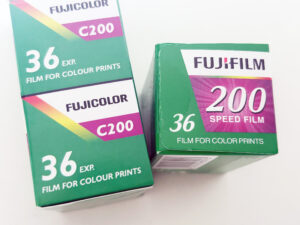
Photographers coming from films such as Kodak Portra 400, Kodak Gold 200, Fujifilm 400 or even Harman Phoenix may find the look too aggressive.
Final Verdict: A Film Trying Too Hard
I appreciate what Lomography was trying to achieve with LomoChrome Color ’92 Sun-Kissed.
The company wanted a film that felt nostalgic, warm, distinctive and unmistakably analogue.

For me, however, it crosses the line from character into gimmick.
The crushed shadows, blown highlights, dominant grain and restricted colour range all combine to create a film that feels overly processed before you’ve even scanned it.
Some photographers will love that.
I didn’t.
After shooting a full roll through my Leica MP and 35mm Summilux, I came away feeling that LomoChrome Color ’92 Sun-Kissed sacrifices too much image quality in pursuit of its aesthetic.
If you’re looking for a bold experimental film stock, it’s worth trying once.
If you’re looking for a film with genuine depth, subtlety and tonal richness, there are better options available.


