Apple’s Magic Mouse has been a topic of considerable debate among users and technology enthusiasts alike. Renowned for its sleek design and seamless integration with the Mac ecosystem, the Magic Mouse is a staple on Mac users’ desks around the world, mine included. However, a distinctive design choice by Apple, placing the charging port on the underside of the mouse, has sparked conversations about functionality, design philosophy, and user convenience. Let’s delve into the intricacies of the Apple Magic Mouse’s design, its charging mechanism, and what it signifies in the broader context of Apple’s design ethos.
The Magic Mouse Charging Dilemma
Many users, including professionals and casual users, have voiced their inconvenience with the Magic Mouse’s charging design. The placement of the charging port on the bottom means the mouse cannot be used while charging, rendering devices like my Mac Studio temporarily inoperative during charging periods is annoying. Critics argue this design decision as either oversight or arrogance, suggesting Apple prioritised aesthetics over practicality.
Design Principles in Question
Apple’s decision with the Magic Mouse’s charging port challenges two fundamental design principles:
Maintaining Brand Image
Apple is synonymous with luxury and innovation. The image of the Magic Mouse, flipped over like a “dead bug” during charging, contradicts this polished image. Seriously, my Magic Mouse looks like a dead bug when charging.
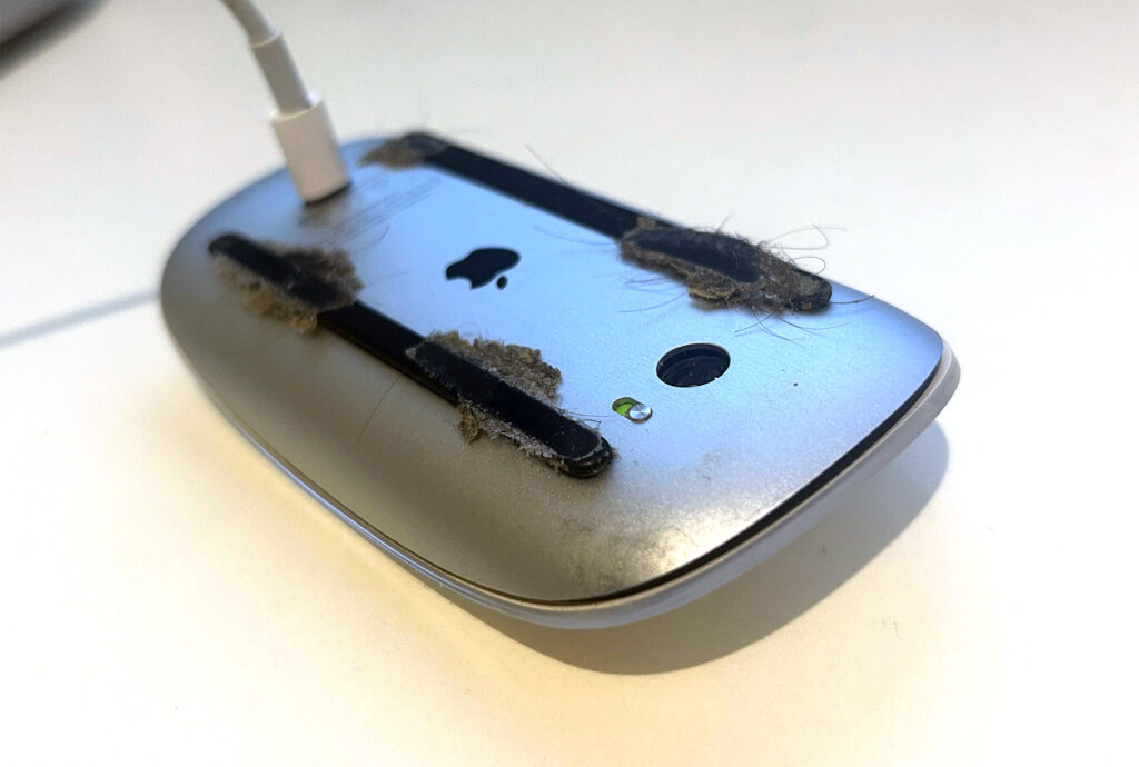
Functionality of Critical Interface Elements
The dependency of Apple’s desktop computers on the Magic Mouse for operation highlights a significant flaw. A dead mouse at crucial moments can tarnish Apple’s reputation for reliability.
Despite these criticisms, some users see the potential for a strategic push towards the Magic Trackpad, which you can use while charging, aligning with a preference for trackpads on laptops but acknowledging a divide in user experience preference at the desk.
A Closer Look at Design Choices
From a product design perspective, the decision to place the charging port underneath the Magic Mouse is not without its reasons. Apple’s philosophy of minimal design changes unless necessary is evident in the transition from removable batteries to a built-in rechargeable system. The argument here is one of aesthetics versus functionality; redesigning the mouse to accommodate a front-facing charging port would compromise its sleek, lightweight design for a seldom-used feature.

The Bigger Picture: Apple’s Vision for Technology
Apple’s history of removing perceived essential features (e.g., Ethernet ports, CD drives, headphone jacks) has often been met with initial backlash, only for the industry and user habits to eventually align with Apple’s forward-thinking approach. This pattern suggests that the design choice for the Magic Mouse may not be an oversight but a deliberate step towards a wireless future, challenging users to adapt to new paradigms.


Charging: Not a Significant Hindrance?
Practically speaking, the Magic Mouse offers rapid charging, with a few minutes of charging providing a full day’s use, and a full charge lasting weeks. This efficiency, combined with macOS’s proactive battery life warnings, means the actual impact of the charging design on daily use is minimal for most users.
The Essence of Design: Form vs. Function
At its core, the debate over the Magic Mouse’s charging port is a reflection of the broader discourse on design priorities. Apple’s design philosophy often embodies the marriage of form and function, with each product challenging preconceived notions of how devices should operate. The Magic Mouse, with its controversial charging design, invites users to reconsider the importance of uninterrupted use versus the benefits of a minimalist, cable-free workspace. The Apple Magic Mouse’s design and charging mechanism encapsulate the ongoing tension between innovation and convenience. While some view the bottom charging port as a flaw, others interpret it as a bold statement on the future of technology, wireless, unencumbered, and subtly nudging user behaviour towards new norms. Whether seen as a design misstep or a visionary move, the Magic Mouse continues to be a focal point in discussions about how technology should integrate into our lives and workspaces. As Apple marches on, it remains to be seen how user feedback will shape the evolution of this device.








3 Responses
When form trumps function, you’re in trouble. A computer mouse is not a cherished work of art. Ultimately, nearly everyone would prefer not to be inconvenienced when using a tool. They carved out a lot of real estate on the actual screen of the iPhone to accommodate a lens, but on a mouse they won’t compromise their esthetic. Cough cough. BS.
I think it is idiotic. I use my computer a lot and when I am shut down like this it makes me really angry that something as benign as a tiny port was deemed too visually horrific by apple to have on a mouse. This company irritates me to no end with their aesthetics over function choices.
Design trumping practicality is design disappearing up its fundament. Looks more like an error to me. We just got caught out with my partner’s new iMac and we’re astonished at the naff positioning of the charge socket rendering the mouse unusable. Smells more like something nobody noticed until it was too late to choruses of ‘You did WHAT?’ Form that gets in the way of function is just bad design, period. Port could easily have been situated in the side – it’s tiny. Big ‘Duh!’ for Apple.
?’