


In the world of design, visual hierarchy is the silent force that directs the viewer’s attention and shapes their experience. Whether you’re working on a website, branding project, or digital content, crafting a clear hierarchy ensures your message is not only seen but understood.
Visual hierarchy is like an invisible map for the eye—guiding users to the most essential information first, then seamlessly leading them through the rest. Without it, even the most visually stunning designs can confuse users, leaving them unsure of where to look.
Here’s how to master the art of visual hierarchy in your designs:
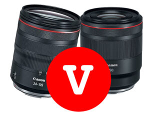
1. Size Matters: Command Attention with Scale
Large elements naturally grab attention first. Think big, bold headlines or eye-catching focal images. By emphasizing size, you create clear entry points into your design. For instance, an oversized call-to-action button immediately signals its importance. See how it works on this document.

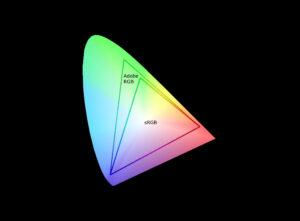
2. Use Color to Create Contrast
Color is one of the most powerful tools in a designer’s arsenal. High-contrast colors draw the eye, while muted tones recede into the background. For example, a bright, standout button on a neutral background screams “Click me!” Incorporate complementary or analogous color palettes to create hierarchy without overwhelming your audience.
3. Choose Typeface Purposefully
Fonts carry emotional weight and guide perception. A bold sans-serif font makes a strong statement, while a delicate serif font adds sophistication. Establishing a clear type hierarchy—headlines, subheadings, and body text—ensures your design flows smoothly. But beware of overcomplicating things with too many typefaces—simplicity fosters elegance.

4. Leverage Spacing for Clarity
Whitespace, or negative space, is your design’s best friend. By giving elements room to breathe, you reduce clutter and enhance focus. A clean, spacious layout is easier to navigate and feels more approachable.
5. Guide Users with Composition and Flow
Grids and alignment create order and logic in your designs. A well-aligned layout not only looks polished but also guides users intuitively through the content. Use composition techniques, such as the rule of thirds or Z-pattern layouts, to direct attention naturally.
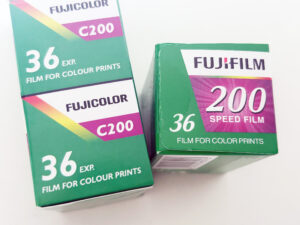
6. Amplify Your Message with Imagery and Icons
Visuals often speak louder than words. Strategically placed images and icons can quickly convey ideas, simplify navigation, and add emotional impact. Choose visuals that enhance your message and avoid overcrowding the design.

7. Maintain Intentional Consistency
Consistency across a design builds trust and familiarity. Repeating color schemes, fonts, and patterns ensures a cohesive experience. Whether users are browsing a website or flipping through a brochure, they’ll intuitively understand the flow and purpose of your design.
8. Test, Iterate, and Perfect
No design is perfect on the first try. Testing in real-world scenarios—whether through A/B tests or user feedback—helps you identify areas for improvement. Sometimes, the smallest tweaks can dramatically improve usability and engagement.

Visual Hierarchy: The Key to Effective Storytelling
Mastering visual hierarchy isn’t just about aesthetics—it’s about creating meaningful, intuitive experiences that guide users effortlessly through your content. Whether you’re building a website, designing for print, or crafting social media visuals, hierarchy ensures your design delivers clarity, impact, and purpose.
When you design with hierarchy in mind, you transform every project into a visual story—one that captures attention, communicates clearly, and leaves a lasting impression.


