


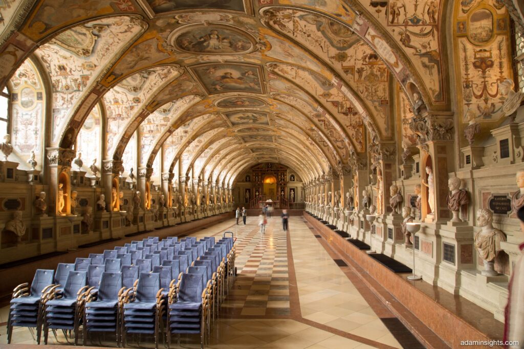
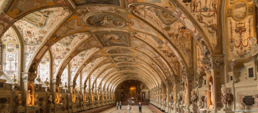
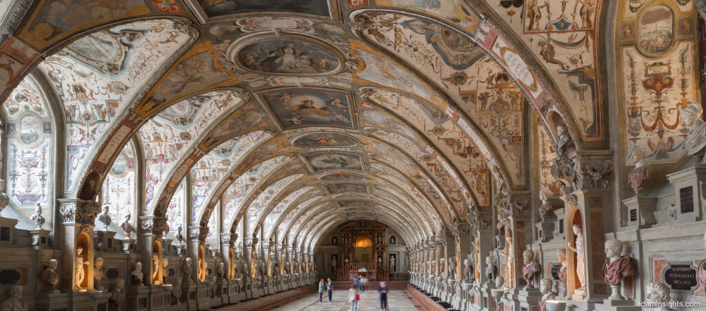
This photo of the Munich Residenz Antiquarium is somthing I am very fond of. I thought I’d use it to show you how, and my philosophy to processing RAW images into usable files.
It started life as a CR2 RAW from a Canon 6D. 24-105L, F8, 50ISO.
For each of these steps I’ve uploaded the full res version of the image so you can download and look closely.
Step 1. The original. From a RAW, nut hopefully everything I am going to show you here will show you the benefits of shooting RAW. Dull, dreary, just the way I like RAWs, they carry so much information.
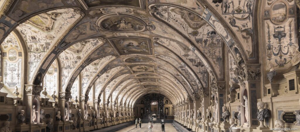
Step 2. I cropped to my desire. Get rid of those ugly chairs!
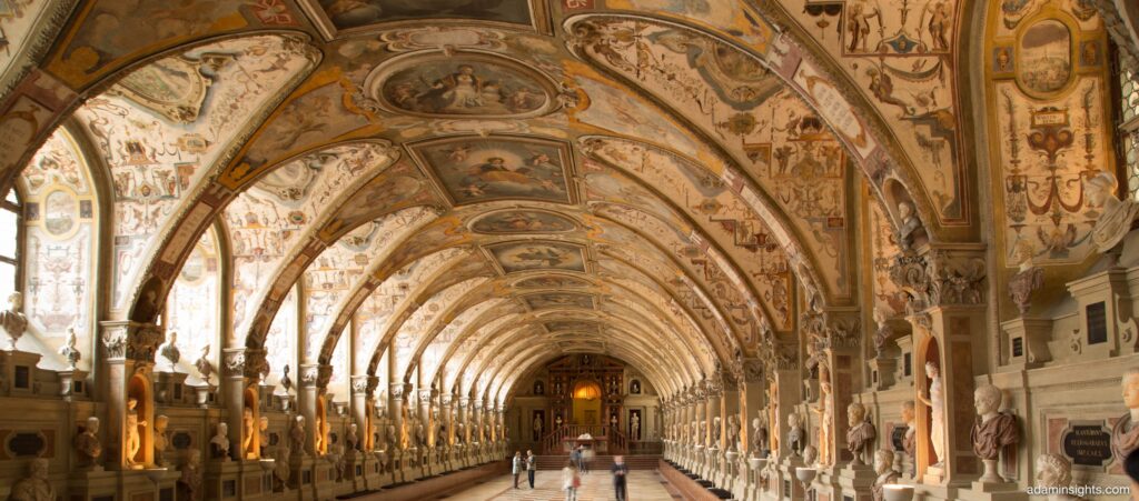
Step 3. I used the Lens corrections in Adobe Lightroom, in this case I fixed chromatic aberration, and then corrected the shot for the profile. Makes a huge difference!
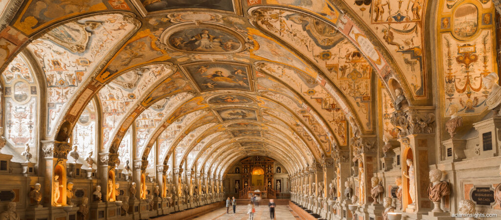
Step 4. I crushed the highlights. What this does is bring back details in the bright areas of a shot such as a bright light. Use this with caution, it is easy to overdo it.
Step 5. I adjusted the contrast, because bringing down the highlights can make the shot look a bit milky with no contrast.

Step 6. You can crush or lift up the blacks/shadows. Crushing makes the blacks very rich and inky, lifting up brings out thiir details. Again, use with caution.
OK, Step 7. In this case I am looking to see what the dominate colour are so I can consider future colour adjustments. Here I have taken the saturation of the oranges right down. Check out how much was in the orange channel!
Step 8. I’ve put the orange back, but also upped the red saturation, dropped the yellow saturation, and darkened the yellows overall by dropping down their luminance.
Step 9. Sharpening. I know this is a contentious issue. In this case, it has benefitted the shot, but post sharpening can leave unwanted artefacts, and plenty of photographers hate doing it.
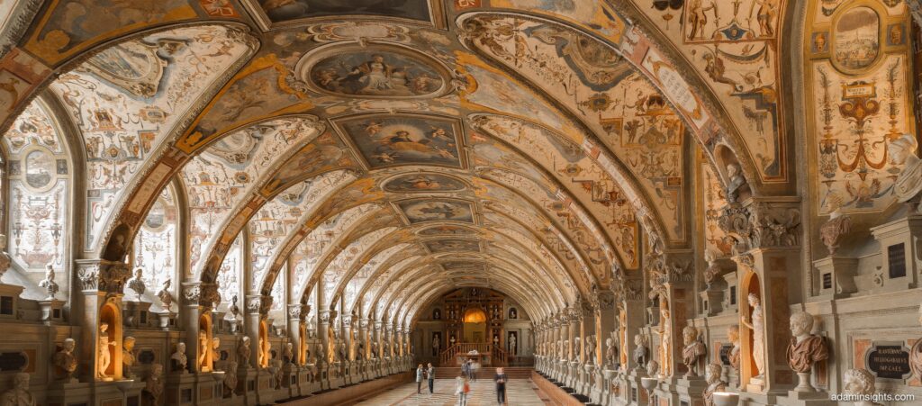
Step 10. White balance. In this case I have tweaked the white balance to make the temperature neutral, but we will come back to this.
Step 10.5. As you can see I can warm the image up, or cool it down. Using the tint function seems to bring out some of the other colours quite well. This is a personal preference thing, and can vary a lot depending on what you want to end up delivering.
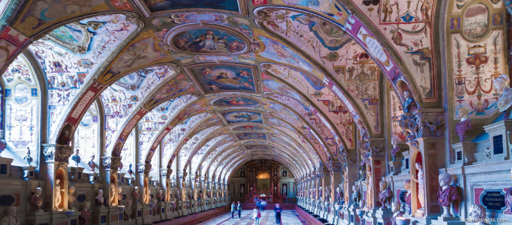
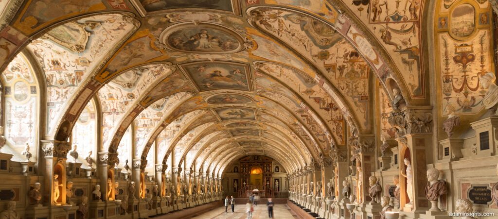
Step 11. In this case, I lifted up the reds some more both in saturation and luminance, and also used the white balance controls to introduce a warm/golden tone. Happy!


