


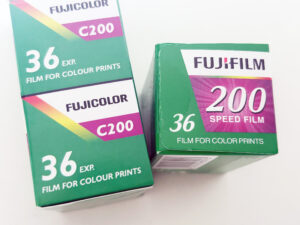


If you’ve ever been curious about Ilford’s take on colour film, Ilford Ilfocolor 400 might just surprise you. In this in-depth review, I put this retro-styled 35mm film to the test with my Leica MP and 50mm Summilux, exploring how it performs across city streets and low-light market scenes in Adelaide. Known for its vintage-inspired tones, Ilfocolor 400 delivers a unique blend of soft colour rendering (with a mix of higher saturation), pleasing grain, and impressive exposure latitude. Whether you’re drawn to its subtle mood, forgiving highlights, or its ability to convert beautifully to black and white, this film offers more than just nostalgic packaging—it offers real creative flexibility and charm for film shooters of all levels.
If you’re into 35mm photography, chances are you’ve heard of Ilford—but probably for their legendary black and white films. So, when I spotted a roll of Ilford Ilfocolor 400 on the shelves at PhotoCo Camera House in Adelaide, I had to give it a go. I always buy my film from PhotoCo—best selection in town, great staff, and their developing turnaround is fast and very competitively priced.
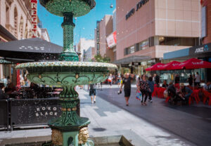
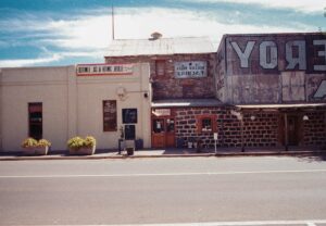
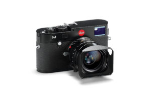
With my Leica MP loaded, 50mm f/1.4 Summilux mounted, and a 24-exposure roll of Ilford Ilfocolor 400 ready, I set off on an overcast day around Adelaide’s city streets. Later, I took the camera into the Adelaide Central Market, shooting wide open to test how the film handles low light. Here’s my honest review after testing this colourful new contender.
What is Ilford Ilfocolor 400?
Ilford Ilfocolor 400 is a 400 ISO, 24-exposure, colour negative film made for 35mm cameras. The film is marketed as having a “vintage tone”, and its packaging harks back to the bold, sporty aesthetic of the 1980s. While it carries the Ilford name, it’s worth noting that this colour film isn’t made by HARMAN Technology (the UK-based maker of Ilford’s B&W emulsions). Instead, it’s produced under the Ilford Imaging brand, a Swiss subsidiary. Checkout my review of HARMAN Phoenix, a very different film.
This may confuse long-time Ilford fans, but the film itself offers something new and nostalgic—especially for those drawn to retro colour palettes.


The Retro packaging of Ilford Ilfocolor 400 caught my eye
There’s something about the idea of Ilford making colour film that feels both exciting and experimental. Having never shot Ilfocolor before, I was intrigued.
First Impressions After the Shoot
When I got my scans back from PhotoCo (same day service—love that!), I was genuinely surprised. I was expecting washed-out, toy-camera-type tones. But Ilfocolor 400 showed a lot more balance.
- Shadows? Nicely open—nothing overly crushed.
- Highlights? Controlled, with lots of retained detail, even under fluorescent market lights.
- Colour? Muted but warm. Slight magenta lean in shadows, but flattering skin tones and earthy street scenes.
- Grain? Present, but not distracting. Typical of a 400-speed stock.
- Sharpness? Better than expected. It’s not ultra-detailed like Portra 160, but I’d happily print up to A3.
My Favourite Ilford Ilfocolor 400 shot
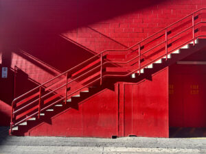
A retro location, with retro vibes, bright colours, low light with bright sources and a vintage color film. This shot for me sums up the Ilford Ilfocolor, how we have a combination of muted moody colours, bright gaudy, detail in the highlights and shadows but still a contrasty look. This is right out of the 1980s (or even before) and I really like it!

Moody Over Precision: Soft Detail and Gentle Colour
I wasn’t sure what to expect in the color for this film. I know there is a retro tone, would that be oversaturated, or have a distinced cast to it, or desaturated?I have seen some reviews where the colour is notably gaudy and over saturated, or the colour looks like 1980 color TV. I did shoot my shots on an overcast day. Hence I do want to shoot them again in bright sunlight to see the difference.
Ilford Ilfocolor 400 isn’t about clinical sharpness or punchy saturation—it’s about character. The detail is absolutely there, but not in a high-resolution, razor-sharp way. Instead, it offers a softer rendering that prioritises mood over micro-contrast. Colours lean toward the desaturated side, giving your images a more subdued, nostalgic feel rather than a bold, modern pop. This makes it perfect for storytelling, street photography, and portraits where atmosphere matters more than technical perfection. If you’re after a film that feels emotional and timeless rather than crisp and hyper-real, Ilfocolor 400 delivers beautifully.
Perfect for Bokeh Lovers: Sharp Subjects, Dreamy Backgrounds
Ilford Ilfocolor 400 really shines when paired with a fast lens and wide apertures. If you love that classic film look with a crisp, sharp subject set against a smooth, blurry background, this stock delivers. Shot wide open with my 50mm f/1.4 Summilux, the bokeh is beautifully rendered—creamy, not chaotic—while the in-focus areas remain detailed and clean. The film’s natural contrast and gentle colour palette enhance the separation between subject and background, making your images feel intimate and cinematic. Whether you’re shooting portraits or isolating details in a busy scene, Ilfocolor 400 gives you that dreamy depth of field without losing clarity where it counts.


Colour Rendering: Vintage, But Not Washed Out
Let’s talk about that “vintage tone” promise. Ilfocolor 400 certainly has a character of its own, but it’s not a heavy-handed filter look. Colours are subdued, with an emphasis on warmth and mood. Think of it as having one foot in reality, and one in nostalgia.
Blues are pale blue, not cyan or deep. Reds pop a little, but greens stay mellow. Yellow signage glowed without oversaturation. Skin tones looked healthy, not orange, maybe a little pale.
If you love the vibe of Kodak Gold but find it too punchy, or you like Ultramax’s speed but want softer contrast—Ilfocolor might be your perfect match.
Light Meets Dark: Beautiful Tonal Balance in Every Frame
What I really love about Ilford Ilfocolor 400 is the way it renders light and dark together in the same frame—especially in scenes like this one. There’s a natural harmony in how the shadows fall away gently without crushing, while the highlights still pop with energy and detail. It gives the photo a cinematic, almost painterly quality. You can expose for your subject in the shadows and still retain enough information in the bright areas to tell a full, dynamic story. It’s this delicate balance between light and dark that makes shooting with Ilfocolor 400 feel so rewarding.

Exposure Latitude: Surprisingly Forgiving
I shot most frames at box speed (ISO 400), and Ilfocolor handled it all with grace. Indoors at the market, where light was mixed and constantly changing, it held its own. I was especially impressed with the way it managed contrasty scenes—you can shoot this in high dynamic range situations and still keep detail in both shadows and highlights.
Balanced Exposure: Shadow Priority Without Blowing Out the Background
One of the standout qualities of Ilford Ilfocolor 400 is how well it handles high dynamic range scenes. I found I could expose for a subject in deep shadow—like a market stall or alleyway—and still retain surprising detail in the bright, overexposed background. The film doesn’t completely blow out highlights the way some colour stocks do; instead, it holds onto enough structure and texture to keep the image feeling balanced and usable. This makes Ilfocolor 400 a great choice for shooting in tricky lighting situations where you want to prioritise your subject without sacrificing the overall composition.
This is huge for street photographers and documentary shooters. You don’t have to baby the meter.
Impressive Dynamic Range: Strong Shadow and Highlight Recovery
Ilford Ilfocolor 400 handles shadow and highlight recovery in Lightroom surprisingly well for a colour negative film. In this screen recording, you’ll notice how pulling back highlights retains detail in bright skies and signage, while lifting shadows reveals texture and depth without introducing excessive noise. This gives you more creative control when editing—perfect for scenes with high contrast or tricky lighting, like shooting indoors or on overcast days. The film’s wide exposure latitude really comes through here, allowing you to recover details that many other consumer colour films would lose.
Grain and Texture: 400-Speed Realism
Grain is always a talking point with ISO 400 film, and Ilford Ilfocolor 400 is no exception. Is there grain? Of course. But it’s pleasing, organic, and not at all intrusive.
If you’re scanning at home or printing up to A3, you’ll get a great look. I wouldn’t call it clinical, but that’s not the point. Ilfocolor is about atmosphere, not pixel-peeping perfection.

This actually really impressed me. In the shadows which tend to stay open, grain is there, noticeable, but not too many details being lost. that said, it is getting a bit murky and lacking contrast.

Sharp Enough to Impress: Fine Detail Performance at ISO 400
For a 400-speed film, Ilford Ilfocolor 400 captures fine detail remarkably well. In this sample image of a street sign and printed text, you can clearly see crisp edges and legible lettering, even when zoomed in. While it won’t match the clinical precision of slower ISO films like Ektar 100, Ilfocolor 400 holds its own impressively—offering enough sharpness to make A3-sized prints look clean and focused. The grain is present but never overwhelming, and it doesn’t obscure details, making this film a solid choice when you need a good balance between speed, character, and clarity. If you have a look at this sample, cropped in close this still looks really good.


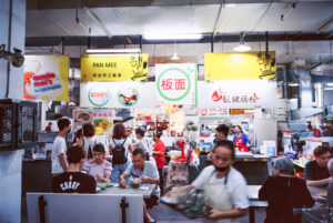
Low Light Performance: Central Market Test
At f/1.4, I took the Leica into the dim corridors of Adelaide Central Market. Harsh fluorescents, mixed lighting, and reflective surfaces—this was a strong test.
Surprisingly, Ilfocolor 400 held up. Grain crept in a bit more here, but detail in the highlights remained. The reds from neon signs weren’t overly clipped, and shadows still had form. This is where the film’s exposure latitude really shined.
If you’re into night markets, indoor cafes, or low-lit alleyway photography, Ilfocolor gives you a real chance at a keeper.
Subtle and Sensitive: Ideal for Low Light and Natural Light
Ilford Ilfocolor 400 is a wonderfully subtle film, especially well-suited for low light and natural or available light photography. It doesn’t overreact to tricky lighting—instead, it delivers soft, balanced tones and a natural colour palette that captures the mood of the scene without overdramatizing it. Indoors, under ambient light or even in mixed conditions like cafes, markets, or twilight streets, it performs with remarkable consistency. The shadows stay open, the highlights don’t clip aggressively, and the film maintains a quiet elegance that feels honest and atmospheric. It’s the kind of film that works with the light you’re given—not against it.


Excellent Flexibility in Post: Vibrance and Saturation Shine
You’ll see just how well Ilford Ilfocolor 400 responds to editing in Lightroom. Boosting saturation and vibrance brings out beautifully rich, vintage-inspired tones without the colours becoming unnatural or harsh.
The film’s base palette is subtle, which gives you plenty of room to shape the look to your taste—whether you want to lean into a warmer, nostalgic vibe or enhance the cooler tones for a more modern feel.

Even with more aggressive adjustments, the colours stay balanced, skin tones remain flattering, and there’s no strange clipping or banding, making Ilfocolor 400 surprisingly flexible in post.
Converting this Color Film to Black and White
One unexpected surprise with Ilford Ilfocolor 400 is just how well it converts to black and white in post-processing. When I dropped a few of my colour negative scans into Lightroom and used a monochrome preset, the results were immediately impressive—deep contrast, rich tonal range, and a surprising amount of detail for a colour-negative film.
Shadows held texture without blocking up, and highlights remained smooth, giving the converted images a classic black and white feel that rivals some dedicated monochrome films. It’s a great option if you’re shooting one roll and want the flexibility to create both colour and black and white images from the same negatives.

Vintage Aesthetic or Just Marketing?
Some have called the film’s “vintage” tone a gimmick, but I disagree. It’s subtle—and I like that. It doesn’t scream faux-nostalgia. Instead, it offers a balanced palette that hints at film stocks from the 1960s and ’70s, without mimicking them.
You won’t get the wild colour shifts of Lomography 100, or the clinical look of Ektar. Instead, you get something authentic, moody, and grounded—like an old family album but with a modern lens.
Who Should Shoot Ilford Ilfocolor 400?
If you fit into any of the categories below, Ilfocolor 400 is well worth a roll:
- Street photographers looking for mood and texture
- Travel shooters after a film with wide latitude
- Film newbies who want forgiving exposure without too much saturation
- Retro lovers who dig warm, subtle colour palettes
- Leica shooters who want something fast but balanced
That said, if you want ultra-punchy colours or high-resolution scanning for big commercial prints, you might prefer something like Kodak Ektar or Fujifilm Pro 400H (RIP).
Comparisons: How It Stacks Up (my thoughts)
| Film Stock | ISO | Colour Tone | Grain | Latitude | Best Use Case |
|---|---|---|---|---|---|
| Ilford Ilfocolor 400 | 400 | Warm, subtle | Moderate | Excellent | Street, documentary, travel |
| Kodak Gold 200 | 200 | Bright, nostalgic | Fine | Good | Sunny outdoor portraits |
| Kodak Ultramax 400 | 400 | Vivid, contrasty | Moderate | Good | Everyday casual shooting |
| Lomo 400 | 400 | Funky, variable | High | Moderate | Creative and experimental use |
Would I Use It Again?
Yes, and I already have another roll ready. It’s not the most vivid film, nor is it the most detailed. But that’s not the point. Ilford Ilfocolor 400 is about character, warmth, and mood. For street walks, market visits, and low-key portraits, it’s now one of my go-to choices.
I’ll keep shooting it when I want a break from digital perfection or a reminder of how photography can feel—not just look.
Ilford Ilfocolor 400 Sample Gallery


Have you tried shooting with Ilford Ilfocolor 400? I’d love to hear what you think. Did you experience the same subtle tones, forgiving exposure, and vintage feel? Or did it behave differently in your camera or lighting conditions? Whether you loved it, struggled with it, or discovered something unexpected, share your thoughts in the comments below. Let’s build a space where film lovers can swap experiences, tips, and sample shots—every roll tells a different story, and yours could help someone else decide if Ilfocolor 400 is right for their next shoot.

