


When exploring camera reviews online, you’ll notice a significant emphasis on achieving sharpness in photographs and selecting lenses capable of producing sharp images. Most camera reviews and buying guides include detailed sharpness comparisons, often conducted in controlled environments. However, there is a common misconception about what sharpness truly is in photography, and it’s important to understand that sharpness and detail are distinct concepts. Contrary to popular belief, the sharpness of a photograph does not solely rely on the megapixel count of your camera or the quality of your lens.
In reality, sharpness in photography is more about perception, heavily influenced by the contrast of light in the images. Technically, lighting equals perceived sharpness in photography. It’s not just about the technical specifications of your camera equipment. The sharpness of an image is essentially the way light interacts to create the illusion of detail. How sharp or detailed a photograph appears can vary significantly based on factors like the angle and quality of light falling on the subject, as well as the chosen focus point in the composition. Therefore, the lighting conditions in which a photo is taken play a more crucial role in determining its sharpness than the camera’s megapixel count or the lens quality.
Lets look at a well lit portrait with the light coming across the subject from the right angle

The right lighting for this photograph has brought out all the details and made the photograph look sharp.
By comparison, this example of a similar subject, angle and photograph is not sharp

Well, the subject, where we need to look is not sharp. But have a look at the red jacket to the left of the picture. That is the sharpest part. Why is it the sharpest part of the picture? Because the light is hitting it at the right angle to enhance the details. Hence, I prove my case: lighting and the way the photographer uses light is the key to sharpness in photography, not lenses, megapixels or film.
When you encounter a type of lighting often described as ‘magic light,’ it is characterised by its softness and relatively low intensity, coupled with a lack of high contrast. This quality of light necessitates only a minimal dynamic range to capture the complete spectrum of details in both highlights and shadows. This capability is crucial for creating an image that conveys a sense of both detail and sharpness. It is what is bringing out the subtle, but fine details we see in these photos
Cameras are adept at capturing this light, and they typically enhance the contrast compared to what the human eye perceives. As a result, what might appear soft and somewhat bland to our eyes can be translated by the camera into an image rich in details and contrast. This phenomenon explains why some photographs may appear extremely sharp at first glance, but upon closer inspection (like zooming in), they may not actually possess that level of sharpness. Conversely, images that are technically sharp with clear details when zoomed in may not have the same visual impact when viewed at a normal scale. This lack of perceptual sharpness can be due to the absence of defining elements such as edge lighting on subjects or other intricate details that typically contribute to a photo’s crispness and clarity.
The concept of sharpness in photography is more psychological than physical—it’s not something that can be quantified or revealed by simply zooming in on an image. Our perception of an image’s detail is most accurate when we view it from a typical distance. For example, we generally view a smartphone screen from around 50 cm away, a computer screen from about 70-80 cm, and a printed picture on a wall from 120 cm or more. Billboards, viewed from a distance of 50 meters or more, appear sharp despite their size but are actually printed at quite low resolutions. For example, an offset print can be 300 dots per inch (dpi), a truck curtain 150dpi and an billboard 50dpi.
Consider this: a photograph occupies the same amount of visual space whether it’s on the small screen of your camera or plastered across a billboard. Rarely do we scrutinise a photo as closely as a photographer who meticulously examines the fine details on their computer screen, a habit I like to avoid known as ‘pixel peeping.’
This scrutiny can sometimes cast a negative light on the concept of sharpness, driving an obsession to achieve it to the point where it’s considered a flaw if one can’t magnify an image to an extreme degree and still observe perfect detail. The irony lies in the fact that this level of magnification is rarely necessary for enjoying a photograph as it’s meant to be seen.
Technically, Photographs can look sharp at the Expense of Detail
We saw this a lot with consumer grade camera films in the 1980s and 1990s. Kodak Gold for example, a consumer grade film was a vibrant, high contrast film that produced punchy, sharp images. Exactly what the consumer wanted in their album. But this was achieved with a larger grain structure to create more defined outlines around objects, so finer details could not be captured.

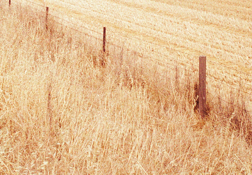
This landscape example, in optimal conditions shows that when we crop in.
A finer grain film on the other hand, like Portra or Ektar have smaller, finer grain so the films lack strongly defines outlines, but capture the fine details.

This landscape, in less that ideal conditions but with a finer grain film shows how we achieve more details but with an image you could initially perceive as not as sharp.

I think the in the digital age, we are all guilty of over sharpening our images. It is too tempting to up the contrast the vibrancy and the digital sharpness, but as we can see that has the effect of hiding details in the shadows, blowing out the highlights, and introducing noise into otherwise smooth areas.
So, we might have an image that looks sharp, but on the other hand lacks details.
A great guide on image sharpening in Adobe Lightroom
I have a lot of respect for Tony and Chelsea Northrup, and have always found their guides invaluable. I recommend their YouTube channel and their courses. For a quick guide on sharpening, and how not to overdo sharpening, this video is worth a watch.
Obviously from a technical perspective, you need to maintain a steady camera, set your aperture correctly and focus on your subject.

Hence, for true sharpness in your photographs that comes from real details being easily perceived, work with the light you have. Megapixels, films, lenses will come later.
What sharpness is in this example, is the focus point, the bird on the far left.

You don’t always need to have the most optimal, studio lighting setup. Just challenge the light that is available to you and achieve real sharpness in your images.

A Word on Retina
When discussing image clarity on digital screens, particularly those with Retina display, it’s commonly suggested that setting your screen to a resolution of 72dpi is ideal. For example, on a MacBook Pro, this would mean adjusting your display settings to the highest possible, which results in very small text and UI elements. Although this might make reading text more challenging, it is considered the best setting for image clarity.
Any resolution setting other than 72dpi effectively acts as a “digital zoom.” This enlarges the image beyond its original resolution, which can lead to a loss of clarity. This principle is particularly relevant when browsing the internet using a browser like Safari, where the standard image resolution is 72dpi. Thus, when you increase the zoom level in your browser, you’re essentially magnifying a low-resolution image, making it appear blurry. However, text remains sharp because browsers are designed to render text clearly at various zoom levels, independent of image resolution settings.
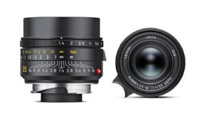
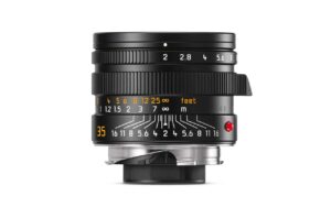
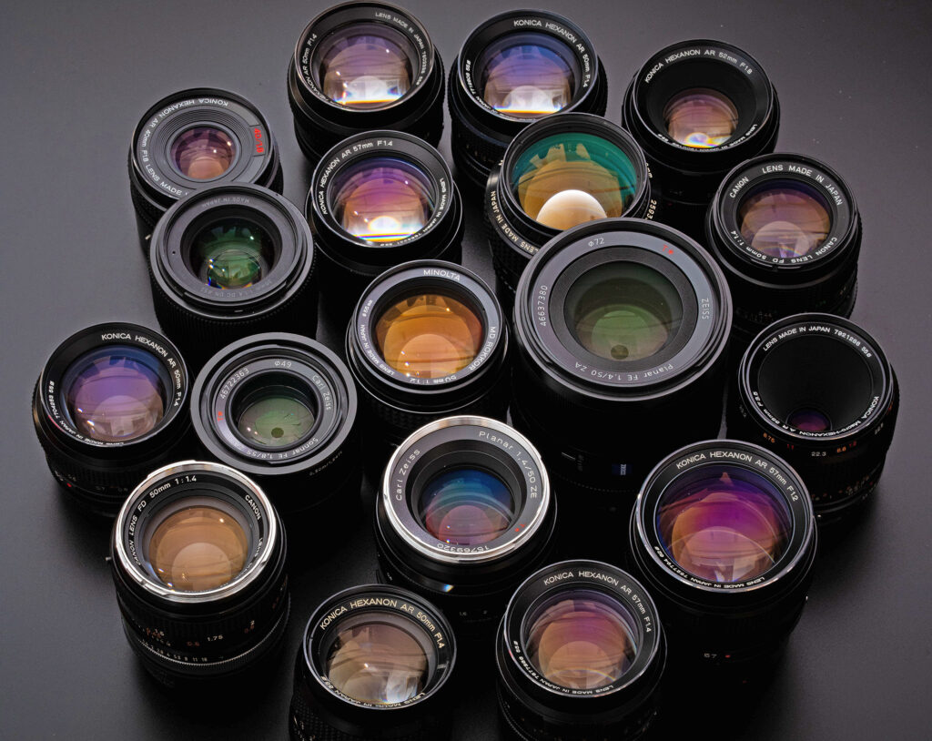
Exploring the Nuances of Leica Optics
Leica lenses have garnered a dedicated following, largely due to their exceptional quality. They are often hailed as the pinnacle of still photography optics. But the term “good lens” can be subjective. The distinctive ‘Leica look’ encapsulates this subjectivity—it’s known for its intricately detailed yet not overly sharp imagery, presenting a visual softness that doesn’t compromise on detail.
This example appears sharp and detailed because of the choice of focus point and the use of depth of field to isolate it.

Here is another example. Shot on the Leica 50mm Summilux, with Kodak Ektar film, it looks sharp with the use of colours, the focus point and how you are drawn to all that. But what else, and how can you describe the photograph as sharp? Everything else around the subject is intentionally not sharp. So why do we as buyers or cameras only worry about sharpness, and not more so about how we can use cameras to create images that people like to look at and tell a story with a more effective use and combination of the sharp and unsharp?

Leica has ventured into the realm of cinema once more with their Leitz Cine brand, where the lenses are praised for their vivid, lifelike quality without an excessively sharp aesthetic. This characteristic is a product of both technological innovation and a philosophical approach to lens-making, which deviates from purely computer-optimised designs that prioritise sharpness above all.
Instead, Leica combines modern computing with a rich heritage of 150 years in optics—a legacy that began with microscope optics and later expanded to camera lenses in the 1920s.
During the lens design process, Leica engineers consult computer-generated calculations but also apply their expert judgment to tweak the design for a visually pleasing outcome. This sometimes means reducing the level of computed sharpness to enhance the overall image quality.
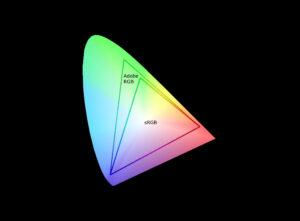
Leica’s meticulous attention to detail extends to examining the Modulation Transfer Function (MTF)—a technical graph that evaluates a lens’s performance. Leica designers like Peter Karbe don’t merely rely on these graphs; they envision the real-world photographic result these graphs represent.
In the intricate dance of lens design, the focus is not just on the sharpness but on how red, green, and blue light rays—the fundamental building blocks of color photography—are manipulated by the lens. Each colour wavelength behaves differently, with red light bending slightly more than the others, a phenomenon that lens designers work to correct. This ensures that all three colors converge accurately on the camera’s sensor, producing a coherent and color-true image.
Zooming into a Leica-captured image reveals its prowess: skin tones appear vibrant and tangible, a stark contrast to the colder, perhaps sharper, renditions from other brands. Leica’s philosophy is not to deliver clinically sharp images but to capture the essence and realism of the scene.
The Perception of Sharpness in Photography
Photographers often grapple with the idea of sharpness, especially in the digital age where images are frequently evaluated on computer screens during editing. This practice stands in contrast to appreciating a printed photo from a natural viewing distance, where the emphasis lies on the aesthetic and emotional impact rather than pixel-level detail.
The true measure of a photo’s quality goes beyond its technical sharpness. It lies in the artistic and emotional resonance it can evoke, qualities that defy quantification. The obsession with sharpness—being able to discern every strand of hair, for instance—is often misguided. The overall impression of the image, what it conveys to the viewer at first glance, is far more significant.

Consider the technological progression from film, which is roughly equivalent to 24 megapixels, to modern sensors boasting up to 150 megapixels. This leap in detail capacity begs the question: what do we gain from this excess? While high megapixel counts can be beneficial for cropping in post-production or specific professional applications, they are not always necessary for general photography.
The discourse on sharpness in photography is thus not just about technical specifications. It’s about how we perceive an image, how the lens translates reality into a photograph, and ultimately, how the photograph affects us as viewers.